Words fail us, literally. More often than not, our devices correct our spelling and grammar, but these fail-safes are not foolproof and, sometimes, our mistakes end up on display for all to see.
How do these design failures happen? Well, spell check can’t catch everything. Beyond that, there’s the human element. The graphic designer who gets too fancy. The missed typo. Engineering fails.
Read on. These design fails are guaranteed to make you smile, or at least make you think.
An Uninspiring Yoga Mat
Let’s imagine a scenario. It’s been a rough day, but you’ve finally made it to yoga class. You’re weary, you’re not sure you can muster that first down dog but, darn it, you’re here, and you’ll draw some inspiration from somewhere. You enter the studio, roll out your mat and … discover that because of a design fail, “Nothing is possible.”
Yoga mat is unintentionally pessimistic (x-post from r/mildlyinfuriating) from CrappyDesign
Space Clouds
Here’s an otherworldly look at the Earth and the sun. There’s one problem, though: Space doesn’t have that blue sky. Or those clouds. If you think of every other photo taken in space, the backdrop is black.
Where on Earth (ahem) did this photo come from? Reddit user Khalifaplay, who posted it, commented that it’s from a social studies textbook. At least it’s not an astronomy textbook?
What a wonderful day outside earth from CrappyDesign
‘Lizzard’ Warning
A list of design fails wouldn’t be complete without at least one electronic road sign fail. This sign warning drivers on New York’s Long Island about a blizzard in the forecast looks like it’s issuing a notice about the impending lizard apocalypse.
The sign, which reads “Lizzard Warning 4am Saturday to on Sunday,” has multiple errors, though. In addition to that crucial missing “B,” the time when the warning ends on Sunday is missing.
These highway signs are set remotely (which partly explains why they’re notoriously easy to hack), so the person writing the message doesn’t get a chance to take a step back and check the message.
Watch out for those lizzards from onejob
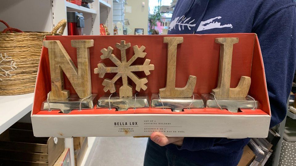
The First Noll
Spelling isn’t easy and, nowadays, our phones and computers usually tell us when we’ve gotten it wrong. However, these holiday “Noll” letter decorations for your fireplace mantel (which should say “Noel”) are missing an important E. Whether this was a packaging error or a spell-check fail, at least it’s giving us a good laugh.
🎵 The first noll, the angels did say… 🎵 from onejob
Four-Alarm Design Fail
Putting The Bathroom Lightswitch Right Beside The Fire Alarm Control Switch In An Elderly Persons Home… #designfail pic.twitter.com/zrG3qIIo5V
— Wtf Buildings (@wtfbuildings) November 20, 2018
Sometimes, design fails are so bad they just aren’t funny. This post shows a bathroom light switch just inches from a control switch for the fire alarm. What!? Imagine getting up in the middle of the night to go and fishing for the light on the wall and accidentally switching on the fire alarm — and you still haven’t managed to find the light.
Genius Grammar
Genius at work from onejob
The packaging says that these reading glasses are “For Genius’s.” Geniuses aren’t always geniuses at grammar, though. The plural of the word “genius” is “geniuses,” no apostrophe.
An apostrophe makes the word “genius” a possessive, as in: “The genius’ editor failed to catch the extraneous apostrophe and missing ‘e’ on her new product packaging and therefore should be fired.”
Genius at work from onejob
Drawers You Can’t Open
Sometimes, we have more questions than answers with design fails. How did this wall get built over these drawers? Did the contractor deliberately leave the handles accessible, even though there’s clearly no opening these? Or were the handles in the way, so the contractor built around them? One commenter on this Reddit post had another excellent question: What’s in those drawers now? Maybe it’s best to leave it as a mystery.
How does one open these from CrappyDesign
Be Careful With Fancy Script
Tis the season for holiday design fails. Check out the tag on this Santa hat. This time of the year does tend to inspire grand gestures, and that includes the use of big, fancy type when we’re talking about Santa himself. However, the “hat” appears to follow the big “S” for Santa … and the hat’s size (adult large!) does give us an extra ho-ho-ho of a chuckle.
Santa did what? from CrappyDesign
Christmas Underwear
This light display in Eislingen, Germany, near Stuttgart, surely arouses some Christmas spirit for residents of the town. Eislingen is home to a storied Christmas Market at this time of year, with makers creating unique gifts and medieval street performers entertaining revelers. But Eislingen is also where you’ll find these panty-shaped light displays floating over the streets.
The Reddit thread for this photo is full of punny gems, such as: “The holidays will be brief this year.” One commenter wrote, “Basically what my Grandma gets me every Christmas.”
I’m already in the Christmas spirit! from CrappyDesign
Advent Calendar Fail
The instructions under the door on this Advent calendar are to find the man running … and he’s directly underneath the cubby holding the chocolate.
My ‘Where’s Wally’ advent calendar isn’t giving me much of a challenge from CrappyDesign
Please Don’t LOL
View this post on InstagramOh my gosh he’s drowning…..lol???? #designfails #goodeffort #notreally
A post shared by Scott Yancey (@scott_yancey) on
Controversial “Flipping Vegas” star Scott Yancey posted this beachfront sign. It’s possible this sign has been around longer than we’ve been texting acronyms like “LOL” to each other. However, some commenters pointed out that not only does it look like the sign is instructing you to laugh out loud if you see someone drowning, but it also could read “Drowning 101.”
Suit Yourself, A Classic Newspaper Design Fail
30 Design Fails That Attract Attention for all the Wrong Reasons#designfail #ux #designhttps://t.co/U1entVAhyl pic.twitter.com/S69cAZsPq4
— InteractionDesignOrg (@interacting) August 7, 2017
Readers expect newspapers to have editors who will catch mistakes like this one. A designer for the Living section of the Pittsburgh Tribune-Review got a tad too clever with the font on this headline for a story about swimsuits. The reflection on “Suit” turns the headline into something we wouldn’t wish upon our worst enemy at the beach. Though this published in 2012, it has turned into a design-fail classic — and we hope journalism students are still learning from it.
Placement Problem
View this post on InstagramA post shared by Dragon Horse Ad Agency (@dragonhorseagency) on
The advertisers who appear on this billboard certainly aren’t to blame for this design problem. There’s nothing wrong with the ad for the diabetes-awareness campaign, nor is there a problem with the McDonald’s ad that lets drivers know there’s a Mickey D’s straight ahead. The huge arrow on the McDonald’s ad, pointing directly to the diabetes ad, however, really could not have been more poorly placed.
Wall Stencil Fail
View this post on InstagramA post shared by Cloudfusion (@cloudfusion) on
It takes a while to decipher what, exactly, this wall stencil is trying to say. That’s why this fail is a twofer. For one, something went way wrong with the design itself. More egregiously, it still somehow ended up on the wall without anyone noticing that anything was wrong.
Hap Pine SS
There’s a whole category of design fails that are a result of designers breaking up words in weird ways. The message painted onto this wall — “Happiness is not a destination, it is a way of life” — is a nice sentiment, but trying to read this jumble isn’t making anyone happy.
hap pine ss is no t a desti nation I t is a way o f life from CrappyDesign
It’s Won Time
This banner at a beer store in Ontario, Canada, has its heart in the right place: “It’s the most wonderful time for a beer.” However, trying to read it is a challenge. As one Reddit commenter said, “I feel like I’ve had a few beers trying to read this.”
Promo spotted at an Ontario Beer Store. from dontdeadopeninside
It Says ‘Merry Christmas’
The staggered letters in this holiday message show us why linear letters are so much easier to read. As one commenter said, “I just thought that the sign wasn’t in English at first.” We’re sure folks in this town knew what the sign meant. Ercrsms Mryhita, everyone!
My Hometown Parade. Dear God. from dontdeadopeninside
Don’t Show Your True Colors, Kids
At first glance, the white lettering on this Pride poster at my high school blends in with the yellow background. Changes the meaning drastically. from CrappyDesign
A high school student posted this design fail seen on a poster at school. It reads “Don’t Ever Be Afraid To Show Your True Colors,” which is a positive message we can all appreciate. However, the words “Be Afraid To” are in white font on the rainbow poster’s yellow stripe, and they’re pretty tough to read. We hope those students aren’t doing yoga on the uninspiring yoga mat, too!
At first glance, the white lettering on this Pride poster at my high school blends in with the yellow background. Changes the meaning drastically. from CrappyDesign
Don’t Be Happy—Worry
View this post on InstagramDesign Fails..😄😅 #graphicdesign #design #designeveryday #designfails #designfail #printdesign
A post shared by Zabid (@zabidkt) on
Because of the placement of the words, this T-shirt’s message is not the one Bobby McFarrin intended with his hit song from the 1980s. Typography differences can be used to call out certain words, as can color, but it’s too easy to look at this shirt and see, “Don’t Be Happy—Worry.”
All You Love Is Need
Here’s another example of typographical differences needing to be strong — really strong — to force your eye to read it differently. As one commenter wrote on the Reddit thread, “Someone has got to learn about contrast.”
ALL YOU LOVE & PIZZA NEED IS from CrappyDesign
Discursive Cursive
Cursive type can look lovely, so long as it’s readable. This Christmas card is supposed to harken to the carol “Silent Night” and read, “All is calm, all is bright.” But the lower-case e really does make us thirsty. It looks like it says, “Ale is calm, ale is bright.”
Ale is calm, ale is bright from CrappyDesign
Don’t Open The Trunk!
That's it: we've reached the peak of user centered design #designfail pic.twitter.com/Mie9p8C7Xb
— Jan Calliauw (@cjancali) January 15, 2018
Snow days are tough enough without all of the snow on your rear windshield sliding straight into your trunk when you open it. Then again, if your intention was to haul snow somewhere on purpose, this might be a design win?
Counting Matters
View this post on InstagramA post shared by Interaction Design Foundation (@interaction_design_foundation) on
The Interactive Design Foundation posted this photo from a children’s book to spread a positive message: Designers can always learn from failure. In this case, the text reads “5 bananas,” but — count ’em — there are actually six.
Know Your Continents
No, not quite from funny
Here’s another design that really needed a fact check. The words on the T-shirt read “Asia,” but this continent is clearly Africa. Then again, maybe there’s a way to turn this wearable mistake into a positive. As one Reddit commenter said, “This is probably a great conversation-starter because people will stop you to correct it.”
No, not quite from funny
Accessibility Fail
It’s going to be tough for someone with impaired vision to read this Braille, which is trapped under glass.
Braille at the ATM, Covered in glass from CrappyDesign
Another Braille Fail
This time, the Braille on these Amazon lockers is easily accessible to someone who wants to read it. The only problem is that it’s upside down. Hopefully, feeling the headphone jack will be explanation enough for anyone with a visual impairment.
Braille installed upside down on amazon lockers from CrappyDesign
Double Vision
A Reddit user spotted a storefront with some extra letters in Perth, Australia, but it turns out this logo design — which reads “Ccity Eelectric Ssupply” — is no one-off mistake. This is City Electric Supply’s display front on all of its stores. One exception: In Colorado, the stores are called “Colorado Electric Supply” and use the same convention, so the signs in the Centennial State read “Ccolorado Eelectric Ssupply.”
Ccity Eelecric Ssupply from CrappyDesign
Cursive ‘Click’ Looks Like Something Else
Er, *what* and collect?! #FontFail https://t.co/lNAqSzrzbK
— Martin (@_SmartUK) November 28, 2018
This is a common readability problem in typography — especially nowadays when we’re always being asked to click on something. Here’s a recent example of this particular design fail: The town of Tonbridge, England, is trying to help local businesses develop their online presence with this “click & collect” campaign. However, the cursive “click” in the graphic — and in particular the kerning, or space, between the letters “c” and “l” — make it look like they’re asking people something NSFW.
Another Fancy ‘S’
Another fancy “S” creates another problematic design. This T-shirt is supposed to read “Super hitters,” and the person who designed it probably thought that by putting “hitters” inside of the baseball bat, they were separating the word enough from the “S.” Which is necessary, because “S” plus “hitters” equals … you know.
Seems like an appropriate jersey for this sub . . . from CrappyDesign
Tide’s Packaging Makes It Look Like Candy
Why you design laundry detergent to look like candy? #designfail pic.twitter.com/ePLAN1iL2o
— Bon Ku, MD, MPP (@BonKu) June 26, 2018
While a lot of these design fails were posted in good, silly fun, sometimes a design fail can ask an important question. Take this tweet from Dr. Bon Ku, who teaches health design. We all know by now that the scary challenge of eating a Tide pod is dangerous, and sometimes even deadly. The phenomenon has prompted both lawmakers and consumers to question why the detergent packets are designed to look like candy kids would want to eat in the first place. But Dr. Ku also asks, what about their packaging?
What do you think? Is this a design fail?
Sponsored Content