You’d think once you’ve seen a company’s logo over and over that you couldn’t have missed anything in it. But your scanning eyes just might have skimmed over these hidden elements of corporate branding. Here are 15 to check out for yourself—some are easier to spot than others, and we’re guessing a few will definitely surprise you!
1. Atlanta Falcons
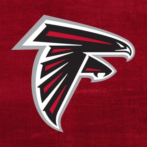
Sure, it’s easy to see the falcon in the Atlanta Falcons logo. But have you ever noticed that the falcon also forms the letter F in the team’s name?
2. Wendy’s
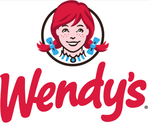
The fast food chain’s latest logo makes Wendy look a bit more natural. And, intentional or not, the word Mom seems to appear in Wendy’s collar—a subtle way to connect the brand with home-cooked meals perhaps?
3. Caribou Coffee
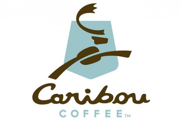
Caribou Coffee’s 2010 logo redesign streamlined the company’s leaping caribou image. It incorporates a coffee bean, C-shaped antler and a national park-like blue shield. It also flips the caribou from left to right, “signifying the direction the company is heading‚ into the future,” according the company’s website.
4. Toblerone
Bear with us, but we bet you missed the symbol in Toblerone chocolate’s mountain logo. It’s in honor of the “city of bears,” Bern, Switzerland, where the company started.
5. Tostitos
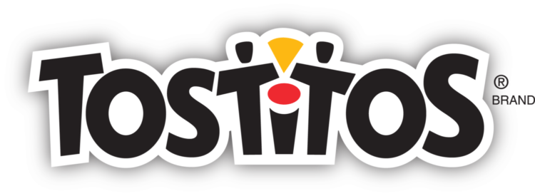
Tostitos’ latest branding nixed its old background but kept the two partying T’s dipping a chip into the red circle of salsa on its letter I.
6. BMW
A widespread story says BMW’s blue and white logo imitates plane propellers as a nod to BMW’s origins as an aviation company. According to BMW, that’s a myth. When it merged with another company named Rapp, it incorporated Rapp’s circular shape and letter positioning in its new symbol. BMW also uses the Bavarian flag’s colors.
7. Tour de France
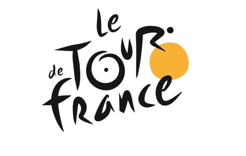
Spot the biker zooming to the right of the Tour de France logo. The yellow front wheel also mirrors the award the famous cycling race’s winners receive.
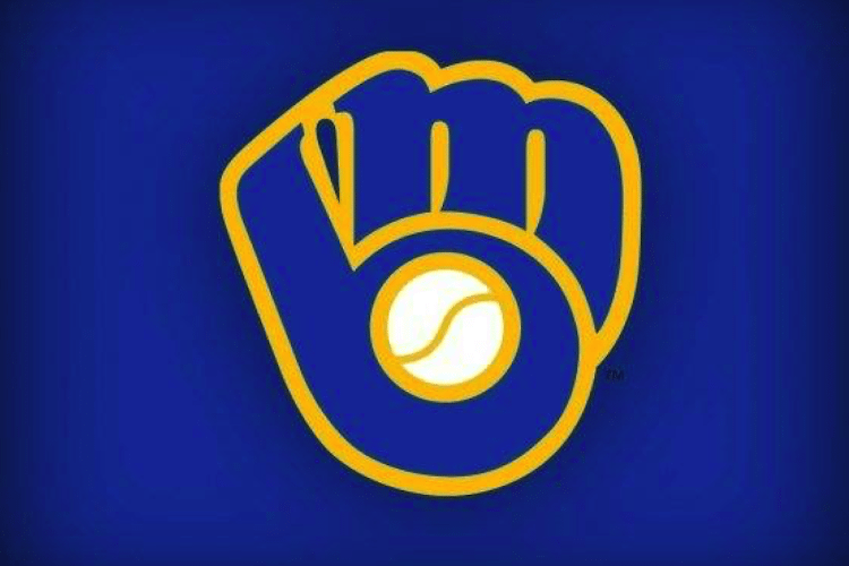
8. Milwaukee Brewers
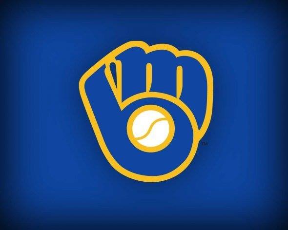
While not the Milwaukee Brewers’ current logo, the baseball team’s 1978-1993 branding is perhaps its most clever. First you see a baseball mitt and ball. Then you see that the mitt and ball also form the letters M and B, just like the team’s initials.
9. Pittsburgh Zoo and Aquarium
Can’t see the forest for the trees? How about the gorilla and the lion? Don’t forget the fish. The use of negative space in the Pittsburgh Zoo and Aquarium branding is wild.
10. VAIO
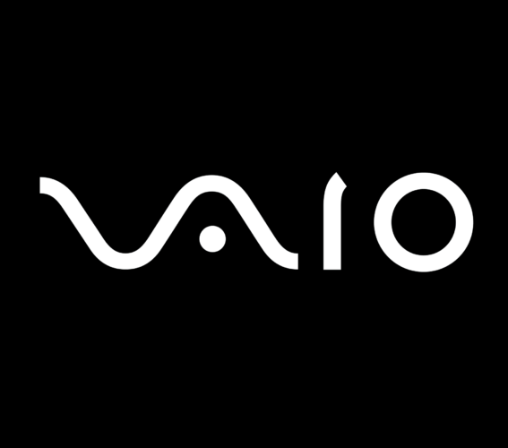
The V and A of VAIO’s logo forms an analog wave. Its I and O represents 1 and 0, as in the binary number system.
11. Baskin Robbins
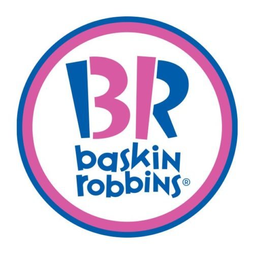
In its logo, Baskin Robbins uses its initials and reminds us that it has a flavor for all 31 days of the month.
12. Amazon
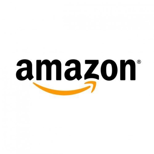
That arrow under Amazon’s name points from A to Z to represent the huge range of products you can buy on the retail giant’s website. And it also adds a cheerful, dimpled smile to the logo.
13. Hershey’s Kisses
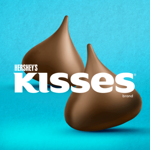
While the older version of the Hershey’s Kisses logo made it a little clearer, you can still spot a candy kiss between the “K” and “I.”
14. FedEx
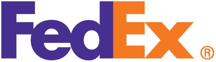
You may already know about the hidden arrow in FedEx’s iconic logo, but you have to admit it’s a pretty clever element built into the company’s name.
15. Toyota
Toyota’s iconic logo has three oval rings that form the letter T. One looks like a steering wheel. The inner ovals “represent the heart of the customer and the heart of the company,” according to Toyota. Supposedly you can also spell out the letters of Toyota using all the rings, though we aren’t quite buying the interpretation of the A.